Help
The Voice of Customer view on the Insights Demand tab shows who is asking, what each audience asks more than others, and how well those questions are answered.
Taxonomy Categories and Semantic Themes answer “what are people asking?”. Voice of Customer adds the audience dimension: for example, whether international enquirers ask about scholarships far more than everyone else, or whether on-campus visitors are the ones hitting a content gap.
This view is only available when visitor profiles are enabled for the service and include at least one reportable field (such as domestic / international, study mode, or campus). Services without visitor profiles are unchanged — the button does not appear.
Opening the report
- Open Insights.
- Open the Demand tab.
- Under View by, click Voice of Customer.
The date range and other filters at the top of Insights still apply. Change the month (or any other filter) and the panels update.
You need a completed theme analysis for the period you are looking at. If clustering has not been run yet, run it from Clustering & Taxonomies first.
How to read the report
Read the panels from top to bottom. Each one answers a different question.
| Panel | Question it answers |
|---|---|
| Coverage line | How much of this traffic do we actually know about? |
| Who visited | Mix of audiences in the selected period |
| What each audience asks | Which topics are unusually common for one audience |
| Where we fall short | Which topics are both busy and poorly answered |
| In their words | Example questions behind the numbers |
Coverage — start here
At the top of the page you will see a line like:
Profile known for 41% of questions (1,204 of 2,950) · 4 fields
Read this line before anything else. It tells you how many questions in your selected period included at least one visitor-profile field we can use for audience breakdowns. In this example, 1,204 questions had profile data and 1,746 did not.
Every panel below is built from that same pool of questions. Slices labelled Unknown are visitors we could not place in an audience — not because they did not ask anything, but because we never recorded that field for them. When you see a finding like “international visitors ask about housing 3× more”, it applies to the international visitors we did identify in this period, not necessarily to every person who chatted. If coverage is low, the patterns may still be useful, but they describe engaged visitors who shared details more than they describe your whole audience.
- Profile known means at least one reportable profile field was recorded on that question (for example domestic / international, or campus).
- Unknown in the bars below is the rest: visitors who never said enough for the assistant to record that field.
If coverage is below 25%, a Low coverage badge appears. The charts are still shown, but treat any “this audience thinks X” claim with care. You are looking at the subset of visitors who volunteered (or clearly implied) those details — often more engaged visitors, not everyone.
Names and email addresses never appear in this report. Only non-personal fields such as enums (a short list of values) and yes/no flags are aggregated.
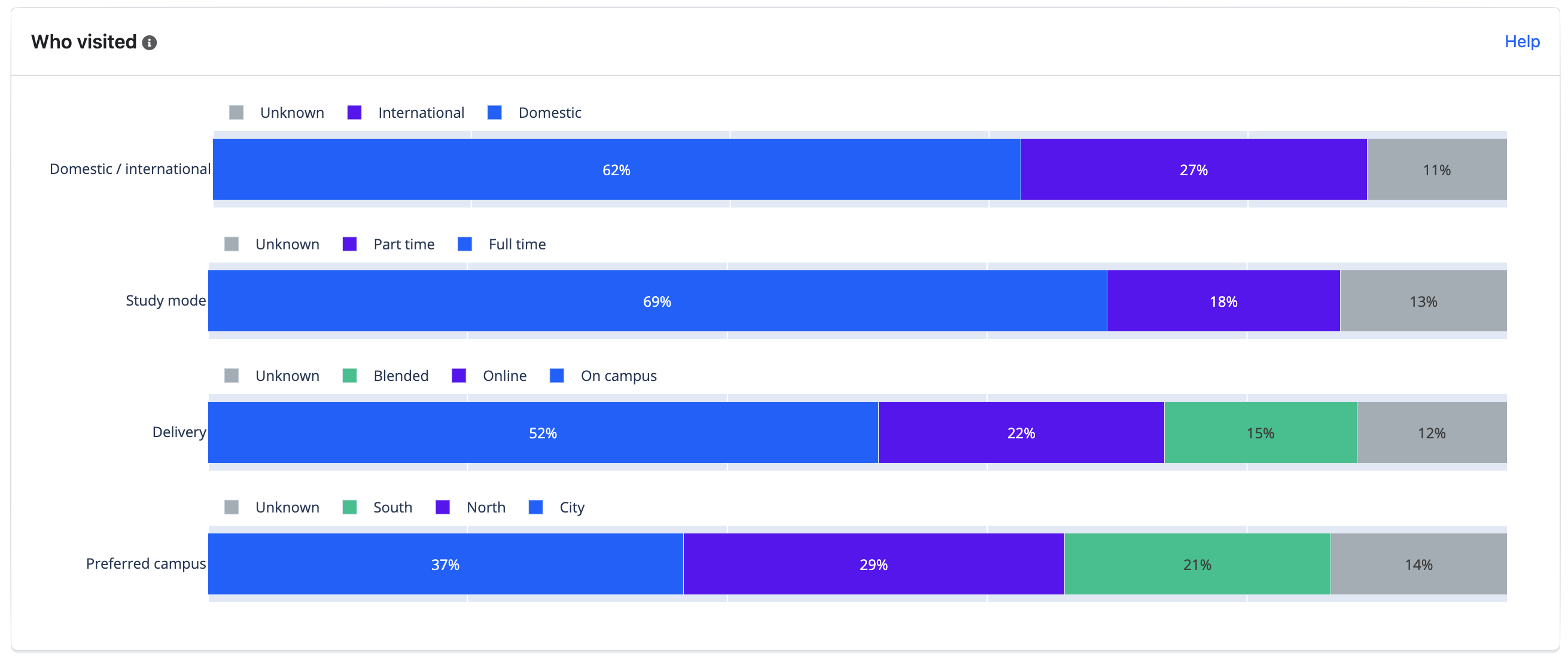
Who visited
Each row is one profile field (for example Domestic / international or Study mode). The bar is 100% of questions in the date range.
- Coloured slices are recorded values.
- Unknown is always included, so the bar adds up to everyone, not only people with a profile.
- Other appears when a value is too rare to show on its own. We hide any slice that comes from fewer than five distinct visitors, and merge those small slices into Other. That stops a tiny cohort from being identifiable.
Use this panel to check whether the mix matches what you expect — for example, a spike in international questions during an overseas campaign.
What each audience asks (the heatmap)
This is the core of the report. Rows are themes (the topics discovered by clustering). Columns are the values of one profile field at a time.
Use the Audience lens dropdown to switch field — for example from Domestic / international to Study mode. Only one field is shown at a time, so you cannot accidentally combine campus × study mode × country into a tiny identifying cell.
Use Rows to switch between Themes and Categories. With Categories, pick a taxonomy and each row becomes one of its categories — useful when you report by department rather than by discovered topic. Category rows count conversations (the same unit as the Category Demand bars), so hover figures say “conversations” rather than “questions”. Clicking a category cell opens Conversations filtered to that category and audience.
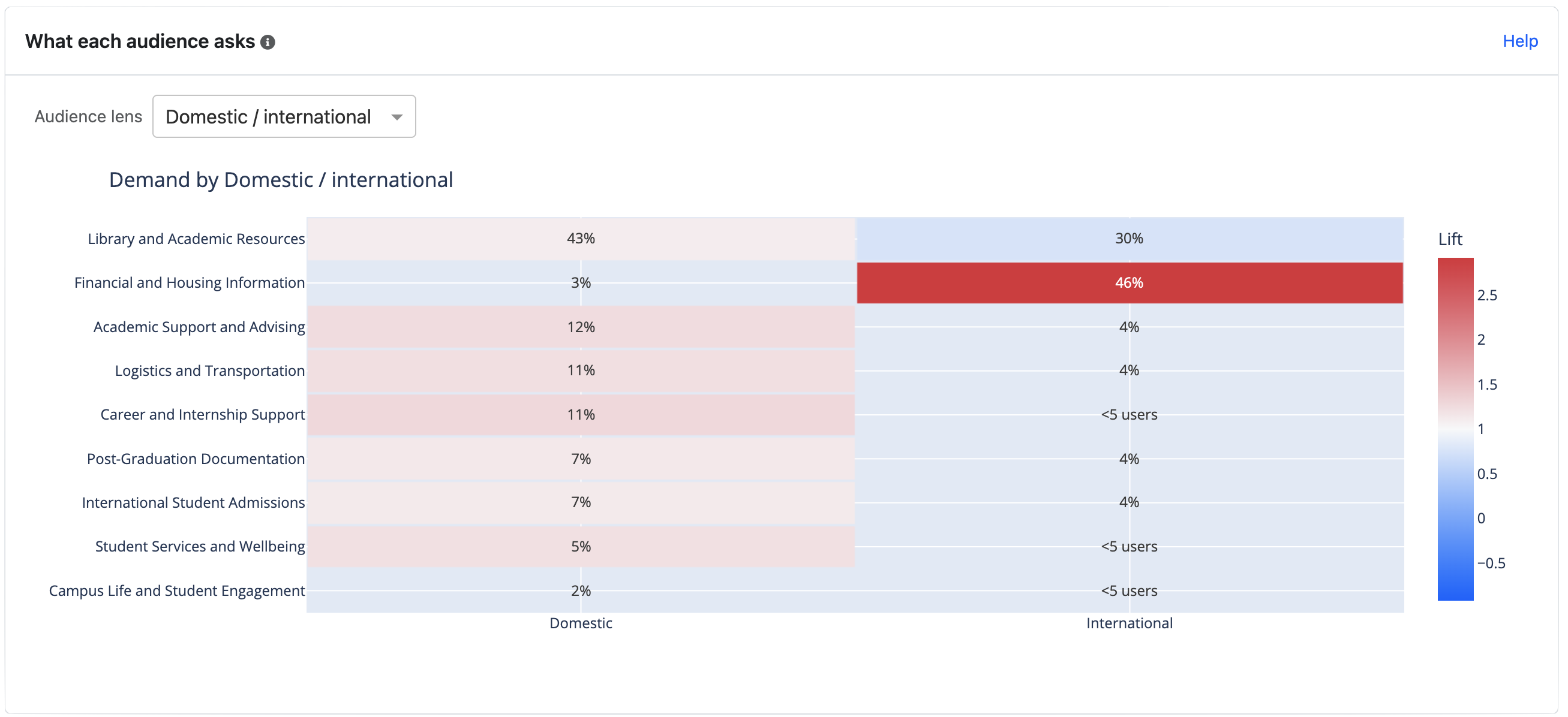
The picture above is an example from Insights. It is not clickable here — open Insights → Demand → Voice of Customer to use the live heatmap.
Cell text
The percentage in a cell is that audience’s share of their own questions that landed in this theme.
Example: if 40% of international questions are about Scholarships, and only 12% of all questions are about Scholarships, international visitors are asking about scholarships much more than everyone else.
Lift
Lift is “how much more (or less) common is this theme for this audience than for everyone?”
A simple way to think about it:
If 10% of all questions are about scholarships, but 30% of international questions are about scholarships, the lift is 3×. Scholarships are three times as common among international visitors as they are overall.
- Around 1× (pale) — this audience asks about the theme at a similar rate to everyone else. Nothing unusual.
- Well above 1× (warmer colour, towards red) — this audience is over-indexed. The topic is characteristic of them.
- Below 1× (cooler colour, towards blue) — this audience asks about it less than others.
Lift is not the same as volume. A theme can have high lift for a small audience and still be a modest number of questions. Hover a cell to see the question count, distinct visitors, and the lift figure together.
Blank or grey cells
| What you see | What it means |
|---|---|
| <5 users | Too few distinct visitors to show. Hidden for privacy. |
| Percentage but no colour | There are questions, but not enough yet to trust a lift figure (we need at least 10 questions in that cell). |
| Empty | No questions for that theme × audience in the date range. |
Do not treat a blank cell as “this audience never asks about it”. It may simply be too small to report.
Clicking a cell
On the live report, click a coloured cell to open the Conversations tab, already filtered to that audience and theme. You can read the actual chats, then use Back to Demand to return. Cells that show <5 users or have no colour do not open Conversations.
Where we fall short
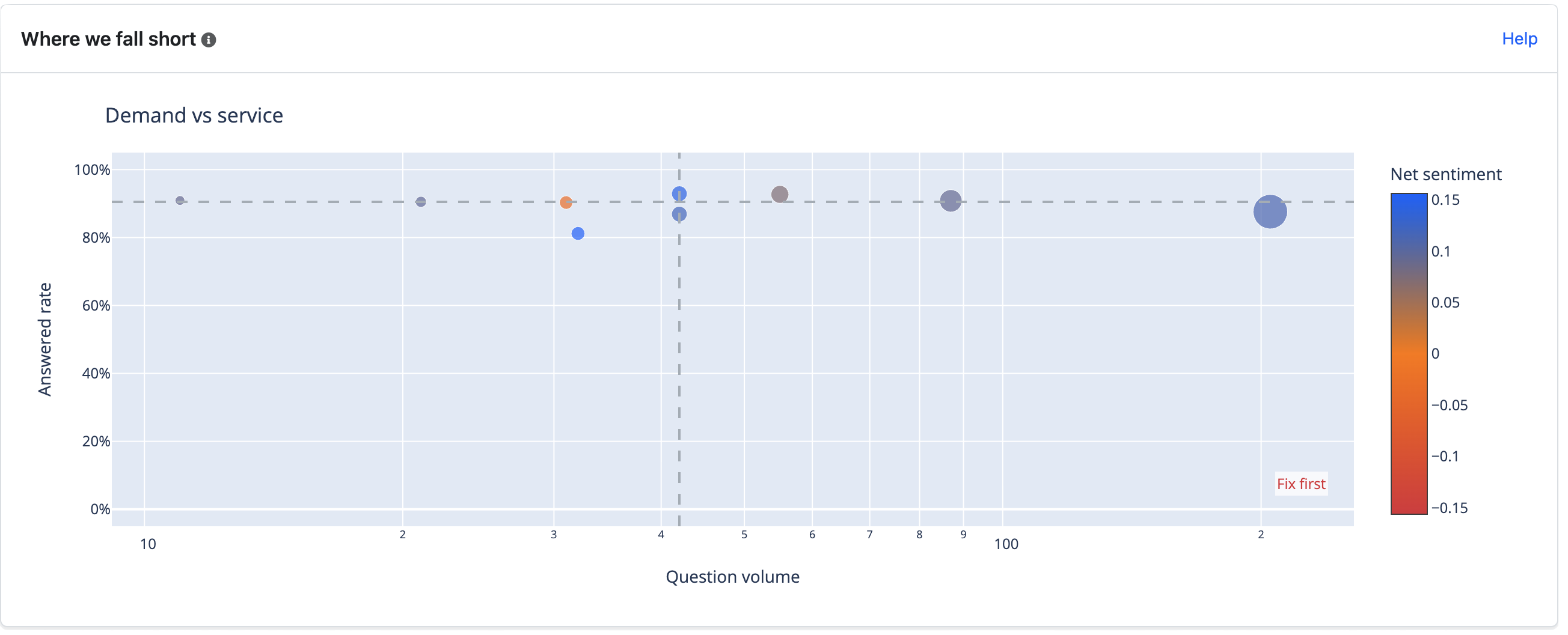
This scatter chart is for the whole population, not one audience. Each bubble is a theme.
- Left to right — how many questions (busier themes sit further right; the scale is logarithmic so a few very large themes do not squash the rest).
- Bottom to top — how completely the assistant answered (answered rate).
- Bubble size — volume.
- Colour — net sentiment (more negative towards red, more positive towards blue).
Dashed lines split the chart at the middle of the themes you are looking at.
The corner labelled Fix first is the one to act on: high volume, low answered rate. Those are the topics where the most people are asking and the fewest are getting a complete answer. That is usually a content gap, a missing curated answer, or an agent prompt that does not cover the topic well.
A busy theme with a high answered rate is working. A quiet theme with a low answered rate may still be worth a look, but it affects fewer people.
In their words
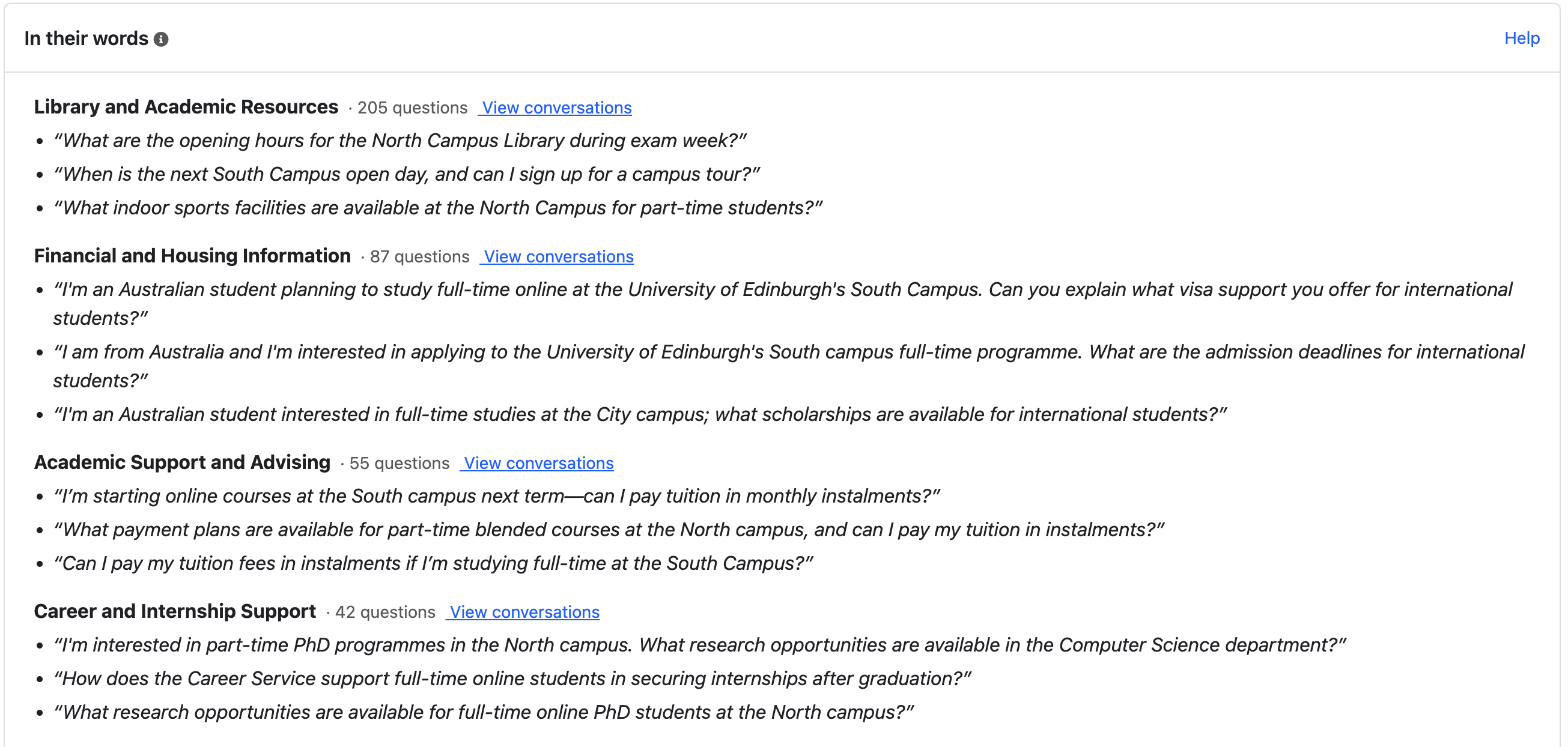
Below the charts, the report lists the busiest themes with up to three example questions each. These are representative questions from clustering, not a random sample.
Read the quotes before you brief a content owner. A “3× lift on Scholarships for international visitors” is more useful when you can see they are asking about OSHC, bank accounts, and arriving before semester starts rather than about the scholarship application form.
Each theme has a View conversations link that opens Conversations filtered to that theme.
Themes and categories
You do not have to open Voice of Customer to see who is asking. When visitor profiles are enabled, the Semantic Themes and Taxonomy Categories views carry the same audience information.
Who's asking (theme and category details)
Click a bar on Theme Demand or Category Demand to open its details. A Who's asking panel at the top shows, for each profile field:
- a bar for this theme (or category) and a thinner All bar underneath, so you can compare the mix at a glance;
- a chip per value with its share and lift, for example International 62% · 2.4×. Warm chips are over-indexed (at least 1.5×), cool chips are under-indexed. Click a chip to open Conversations filtered to that theme or category and that audience.
The caption says how many of the item's conversations have a known profile, for example “Profile known for 38 of 120 conversations (32%)”.
Shares here are of conversations with a known value for that field. Unknown is left out of the bar and reported in the caption instead. This is different from Who visited above, where Unknown is a slice of the bar. Both panels count conversations with a known profile the same way; they just draw the unknown part differently.
If fewer than 10 conversations in the item have a known profile, the panel says “Not enough visitor-profile data for this theme yet” instead of showing percentages. The same privacy rules apply as on the heatmap: values from fewer than five distinct visitors are merged into Other, and lift needs at least 10 conversations.
When you open details from a bubble on the evolution timeline, the panel covers that month only.
Audience Skew filter and 👥 marker
A 👥 after a bar label means one audience is strongly over-represented in that theme or category: its value is at least 3× as common as across all conversations, based on at least 10 conversations. Hover the bar to see which audience, for example “Over-indexed: International 3.4× (85% vs 25% overall)”.
The Audience Skew filter button highlights only those bars. The Export CSV gains a Top audience column with the same finding.
Colour by
The Colour by dropdown above each demand chart switches the bar colours from answer status to a profile field. Each bar is then split by the audience mix among its known-profile conversations, so a bar that is 70% international shows 70% of its length in the international colour. The split is an estimate for the whole bar — it applies the known-profile mix to all of the item's questions. Bars with fewer than 10 known-profile conversations stay grey (“Not enough profile data”).
Switch back to Answer status for the usual needs-attention and negative-sentiment colours.
Filtering by audience
Open Filters at the top of Insights and expand Visitor profile to limit every tab to one or more audience values, for example only international enquirers. A note under the filter chips reminds you that visitors with no profile are now excluded and shows what share of all conversations remain, for example “120 of 3,000 in this period (4%)”. Remove the chip, or clear the dropdown, to go back to everyone.
Putting it together
A typical reading for a planning meeting:
- Check coverage. If it is low, say so in the narrative (“based on the 41% of questions with a known profile”).
- Note any mix shift in Who visited.
- On the heatmap, look for warm cells — those are the “this audience cares about X” findings. Hover to confirm there are enough questions and visitors.
- On Where we fall short, see whether those same themes also sit in the fix-first corner. A high-lift topic that is also poorly answered is the strongest case for a content update.
- Take two or three quotes into the meeting, then click through to Conversations if you need evidence.
What this report does not do
- It does not replace Taxonomy Categories or Semantic Themes. Those remain the views for “what was asked” and for reporting by department.
- It does not show day-by-day audience trends or month-on-month mix shift yet. Use the date picker to compare two periods yourself.
- It does not include free-text or personal fields (name, email, organisation typed as a sentence). Only fields with a short, fixed list of values, or yes/no flags, are aggregated.
- It does not combine two profile fields in one chart. If you need “international and on-campus”, open Filters → Visitor profile, choose one of them, then read the remaining panels by the other.
Tips
- Always state coverage when you share a finding. “International students ask about housing 3× more” is only true of the visitors whose profile includes student type.
- Hover before you brief. Lift without volume can look dramatic on a small slice.
- Match the date range to a clustered month (for example a full August) if you want the heatmap to line up with the monthly insights digest.
- The Audience lens shows one field at a time on purpose. You can switch between Domestic / international, Study mode, Campus, and so on, but you cannot view two fields crossed together in one heatmap (for example international and on-campus in the same grid). That is deliberate: a combined grid would create very small cells — sometimes only one or two people — which could let someone work out who a visitor was. The underlying data may include several profile fields per conversation; the report simply will not display risky combinations. When you share findings, stick to one lens per chart — do not merge screenshots or exports into a DIY cross-tab that could expose individuals.
- Unknown is a result. A large Unknown slice may mean the assistant is not picking up the field, or that visitors truly do not mention it. That is a prompt or playbook question, not a demand question.
Related documentation
- Taxonomy Categories — Governed categories for the same conversations
- Semantic Themes — Discovered topics for the same conversations
- Clustering & Taxonomies — How to run clustering and maintain taxonomies
- Visitor Profiles — How profile fields are collected in chat
- Customer Service Insights — Conversations tab, filters, and export