Help
Taxonomy Categories on the Insights Demand tab shows what people asked, organised into your category structure — departments, product lines, enquiry types, or whatever taxonomy you publish.
This is the governed view: questions are classified against categories you define, so reporting stays consistent and can be owned by the right team. For automatically discovered topics, use Semantic Themes instead.
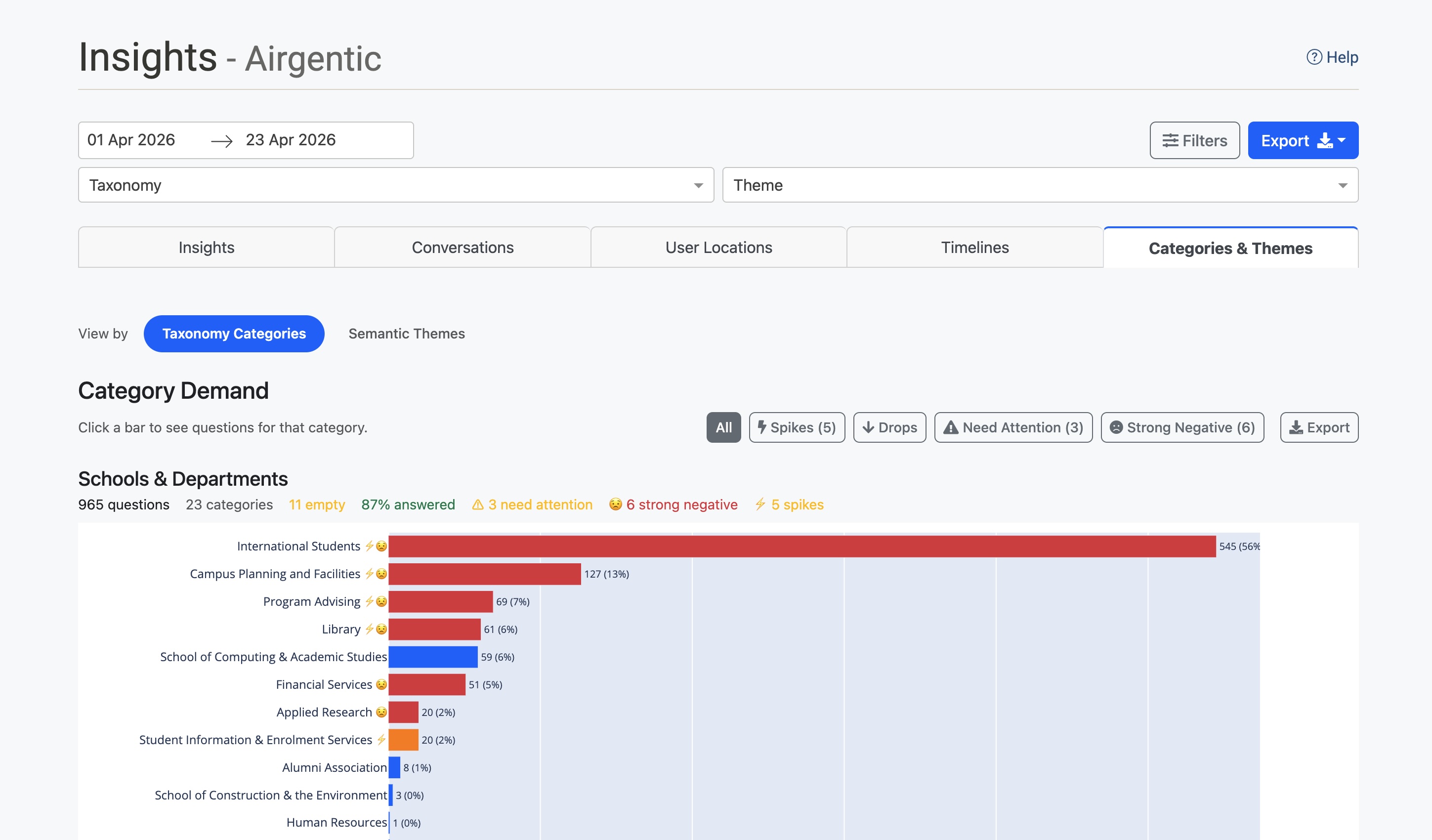
Opening the view
- Open Insights.
- Open the Demand tab.
- Under View by, click Taxonomy Categories.
The date range and other filters at the top of Insights still apply.
You need at least one published taxonomy. Create and publish taxonomies from Clustering & Taxonomies. Until a taxonomy is published, this view has nothing to classify against.
The same tab also has Semantic Themes and, when visitor profiles are enabled, Voice of Customer.
With visitor profiles enabled, category details also show Who's asking, and Category Demand gains a 👥 audience-skew marker, an Audience Skew filter and a Colour by audience option. See Themes and categories.
How categories work
A taxonomy is a structured set of categories that match your organisation's terminology and ownership.
For example, a university taxonomy might include:
- School of Business
- School of Engineering
- School of Health Sciences
- Student Services
- IT Support
A customer service taxonomy might include:
- Billing & Payments
- Technical Support
- Returns & Refunds
- Account Management
Each node can have an owner (the team or person responsible) and a description that helps the AI decide what belongs there.
You can publish multiple taxonomies for the same conversations. One might organise by department, another by enquiry type — two views of the same questions.
Questions are classified against published taxonomies every night. Unlike themes, which are discovered from the data, categories only exist if you defined them.
The Taxonomy Categories view
The view shows your taxonomy categories as charts:
- Category Demand — A bar chart of question volume per category, sorted by count
- Category Evolution — A bubble chart of how category volumes change over time
Each category bar shows:
- The category name with indicator badges (⚠ needs attention, 😟 strong negative sentiment)
- Question count and percentage of total
- A trend indicator if historical data is available
Hover over any bar for answer rate and sentiment breakdown.
Click any bar to open a drill panel of questions assigned to that category. From there you can:
- Click View Themes to switch to Semantic Themes, filtered to themes that have questions in this category. The Theme dropdown at the top of the page is set automatically.
- Click View Conversations to open the Conversations tab filtered to that category. The Category dropdown is set automatically.
The summary strip at the top shows:
- Total questions analysed
- Number of categories tracked
- Categories needing attention (low answer rate)
- Categories with strong negative sentiment
Use the filter buttons (Spikes, Drops, Need Attention, Strong Negative) to highlight categories that match those criteria.
Drilling through
Clicking a bar or bubble opens a detail panel. From there:
- View Conversations — Jump to the Conversations tab with the category filter pre-applied. A banner shows the active filter and a Back to Demand button.
- View Themes — Switch to Semantic Themes filtered to themes that overlap this category. A banner on the themes view shows the active category filter and a Clear button.
The Category dropdown at the top of Insights is set so you can always see what you are looking at. The filter clears when you switch views again or change taxonomy, so you do not get stuck in a filtered state.
Use View Themes when you want to ask "which discovered topics are driving this category?" without leaving the page.
Date ranges
Category assignments are calculated per question, so the date range filter is precise: you see questions asked in the dates you selected, in the categories they were classified into.
That differs from Semantic Themes, where cluster membership is decided by calendar month. If you filter to mid-month dates, category counts still follow your exact range.
Nightly updates
Classification runs automatically every night at 04:00 UTC, assigning questions to your published taxonomy categories.
The current month can still change as new conversations arrive. Previous months are stable.
If you change a taxonomy (rename a node, add a description, publish a new tree), the next nightly classification uses the published version. You can also run analysis from the Conversational Intelligence screen.
Monthly insights digest (email)
On Conversational Intelligence, the Insights Subscriptions tab can send a monthly email of the strongest signals — including category volume spikes or drops and answer gaps. The digest covers the previous calendar month. Delivery defaults to the 1st of the month at 09:05 Australia/Sydney. Use Preview or Send test email before relying on it.
The email links back into Insights with the same date slice. The dashboard is still where you explore the full picture.
Using filters
This view respects the global filters at the top of Insights:
- Date range — Focus on a specific period (category counts follow the exact dates)
- Taxonomy / Category / Theme — Restrict to a taxonomy, category, or overlapping theme
- Sentiment — Positive, negative, or neutral conversations
- Geography — Country, region, or city
- Channel — Website or entry point
- Agent — Responding agent
A loading indicator appears while the charts refresh.
Metrics and indicators
Quick stats
- Questions analysed — Total questions in the current view
- Categories identified — Number of active categories
- Need attention — Items with answer rate below 85%
- Strong negative sentiment — Items with negative sentiment above 5%
Filter buttons
| Button | Shows |
|---|---|
| All | All categories (default) |
| Spikes | Unusual increases in volume |
| Drops | Unusual decreases in volume |
| Need Attention | Low answer completeness |
| Strong Negative | High negative sentiment |
Hover a filter button for the criteria and how many items match.
Hover tooltips
Hover a bar for unique question count and percentage, occurrence count (if different), answer rate, negative sentiment, and any attention or sentiment warnings.
Practical applications
Report by business unit
Use categories to report demand by department, product line, or another organisational dimension. The governed structure keeps categorisation consistent over time.
Identify content gaps
A category with high volume and low answer completeness (⚠ badge or Need Attention) often means you need better content, a curated answer, or a prompt change for that team’s topics.
Track the impact of changes
After you update prompts or content, use trend indicators and the evolution chart to see whether that category’s outcomes improved.
Export data
Click Export on a chart to download CSV for stakeholders who do not have admin access.
Tips
- Publish the taxonomy first — This view only classifies against published taxonomies.
- Write clear node descriptions — The classifier uses them; vague descriptions produce messy assignments.
- Use multiple taxonomies when different stakeholders need different slices of the same conversations (department vs enquiry type).
- Start with high-volume categories to see what is driving the most questions.
- Drill through to conversations before you brief a category owner.
- Pivot to themes with View Themes when you want the unanticipated topics inside a governed category.
- Cross-reference sentiment with the Strong Negative filter.
Related documentation
- Semantic Themes — Automatically discovered topics from the same conversations
- Voice of Customer — How to interpret the audience report on the same tab
- Clustering & Taxonomies — Create, publish, and maintain taxonomies
- Visitor Profiles — How profile fields are collected in chat