Help
Categories & Themes
Taxonomy Categories & Semantic Themes on the Insights screen helps you understand what your customers are asking about — organised into stable themes you can track over time and governed categories that match your organisation's structure.
While the other Insights tabs show individual conversations and point-in-time metrics, Categories & Themes reveals patterns: which topics are growing, which are declining, and what new questions are emerging.
How It Works
Categories & Themes uses AI to analyse the questions users ask your service. It provides two complementary views of the same conversations:
Semantic Themes — Discovered automatically by clustering similar questions together based on their meaning. Themes are generated bottom-up from the data itself, so they surface topics you might not have anticipated.
Taxonomy Categories — Defined by you through taxonomies that reflect your organisation's structure (e.g. departments, product lines, enquiry types). Questions are automatically classified against your taxonomy categories using semantic matching.
Both views are updated nightly as new conversations come in, so emerging topics are surfaced within a day of appearing.
Questions
At the lowest level, the system captures the standalone question from each user interaction — a clear, self-contained version of what the user was asking. Questions that are semantically similar (asking about the same thing in different words) are grouped together.
Semantic Clusters
Clusters are groups of very similar questions discovered during a monthly analysis period. The system uses AI to identify questions that share the same intent and groups them together.
For example, these questions would likely end up in the same cluster:
- "How do I reset my password?"
- "I forgot my password, how do I get a new one?"
- "Password reset not working"
Clusters are refreshed each calendar month. The current month's data is marked as preliminary since new conversations are still being added.
Semantic Themes
Themes are stable, persistent categories that exist across time. While clusters are recalculated monthly, themes provide continuity for tracking and reporting.
Examples of themes might include:
- Connectivity Issues
- Password Reset
- Returns & Refunds
- Product Setup
Each theme has an AI-generated label and description that captures the common intent behind the questions it contains. When new clusters are discovered, the system automatically maps them to existing themes using embedding similarity — or creates new themes if the cluster represents something genuinely new.
Themes are designed to stay consistent so you can track trends month over month.
Taxonomy Categories (Governed Classification)
In addition to automatic theme discovery, you can define your own taxonomy — a structured set of categories that match your organisation's terminology and ownership structure.
For example, a taxonomy for a university might include:
- School of Business
- School of Engineering
- School of Health Sciences
- Student Services
- IT Support
Or a taxonomy for a customer service team might include:
- Billing & Payments
- Technical Support
- Returns & Refunds
- Account Management
Each node in the taxonomy can have an owner (the team or person responsible for that topic) and a description that helps the AI understand what belongs there.
You can create multiple taxonomies for the same data. For instance, one taxonomy might organise by department while another organises by enquiry type — giving you different views of the same conversations.
Questions are automatically classified against your published taxonomies every night. This gives you a governed, consistent view that aligns with your business structure.
How Clustering Works with Date Ranges
Understanding how clustering relates to date filters is important for interpreting your data correctly.
Monthly Clustering Periods
Topic clusters are generated on a calendar month basis. Each month, the system analyses all questions from that month and groups them into clusters. These clusters are then mapped to themes.
- January's clusters contain questions asked in January
- February's clusters contain questions asked in February
- And so on...
Within each month, clusters are updated nightly as new conversations arrive, but the clustering period always aligns with the calendar month boundary.
Date Range Filters and Themes
When you apply a date range filter (e.g., "15 March to 15 April"), the theme and cluster data you see is based on the clustering runs that overlap your selected dates. This means:
- If your range spans parts of two months, you'll see themes from both months' clustering runs
- The counts shown represent questions within your date range, but the cluster groupings themselves were determined at the monthly level
For example, if you filter to "15 March – 15 April":
- You'll see themes that appeared in March's clustering AND/OR April's clustering
- Question counts will be filtered to your exact date range
- But a theme's existence depends on whether it was discovered in either monthly run
Implications
- Exact date precision: Category assignments (taxonomies) are calculated per-question, so category filters are precise to your date range
- Monthly boundaries for themes: Theme discovery and cluster membership are determined monthly, so theme-related views reflect the monthly clustering periods that overlap your dates
- Current month is preliminary: The current month's clusters are still being refined as new conversations come in
This design ensures themes remain stable and comparable across time while still allowing you to filter and slice the data.
The Categories & Themes Tab
The Categories & Themes tab shows your themes and categories in two connected views, accessed via the Taxonomy Categories and Semantic Themes buttons:
Taxonomy Categories
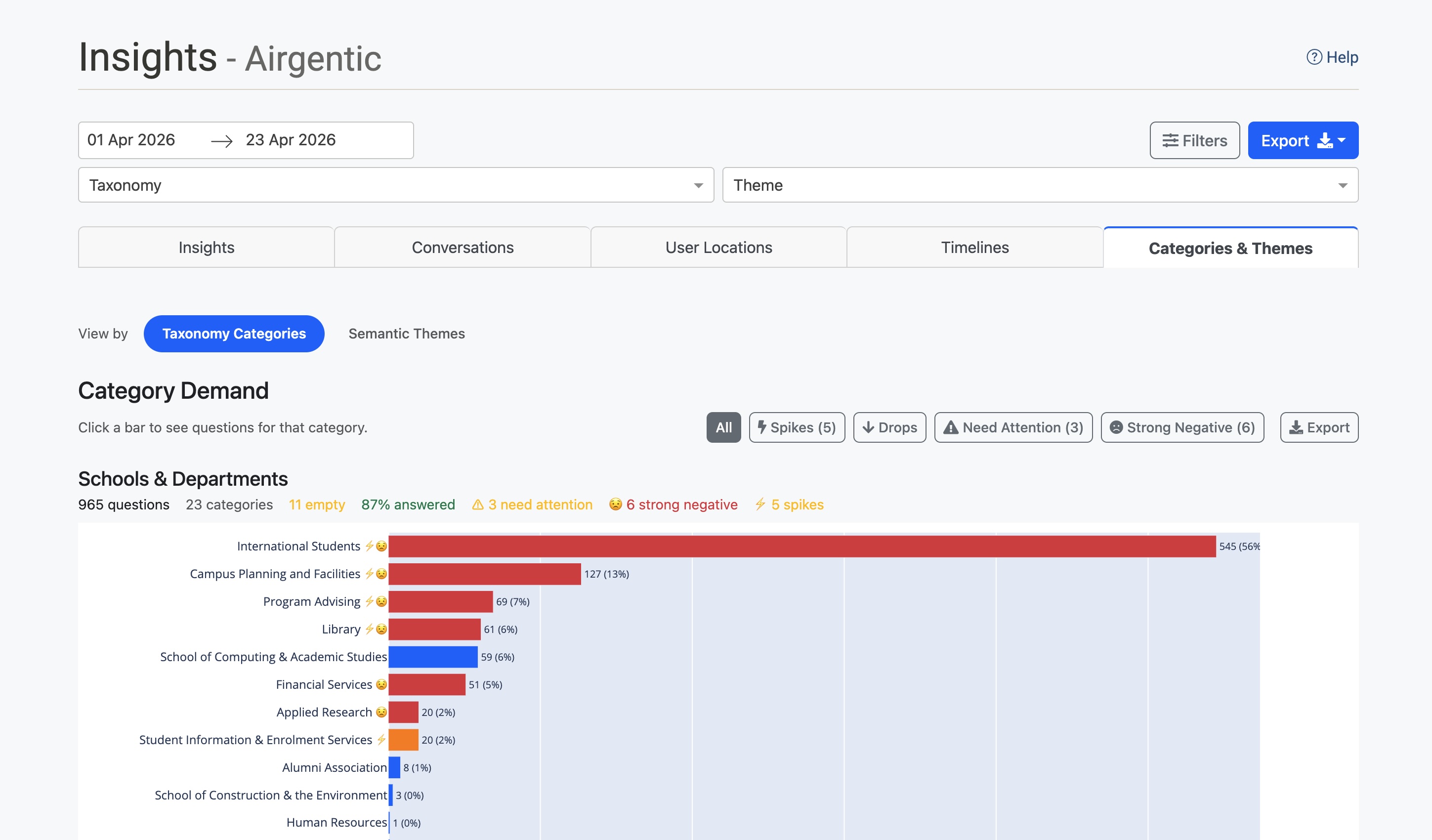
The Taxonomy Categories view displays your taxonomy categories as horizontal bar charts:
- Category Demand — A bar chart showing question volume per category, sorted by count
- Category Evolution — A bubble chart showing how category volumes change over time
Each category bar shows:
- The category name with indicator badges (⚠ needs attention, 😟 strong negative sentiment)
- Question count and percentage of total
- Trend indicator if historical data is available
Hover over any bar to see detailed metrics including answer rate and sentiment breakdown.
Click any bar to open a drill panel showing the questions assigned to that category. From there, you can:
- Click View Themes to switch to the Semantic Themes view, filtered to only the themes that have questions in this category. The Theme dropdown filter at the top of the page is also set automatically.
- Click View Conversations to navigate to the Conversations tab filtered to show only conversations in that category. The Category dropdown filter at the top of the page is set automatically.
The summary strip at the top shows:
- Total questions analysed
- Number of categories tracked
- Categories needing attention (low answer rate)
- Categories with strong negative sentiment
Use the filter buttons (Spikes, Drops, Need Attention, Strong Negative) to highlight categories matching specific criteria.
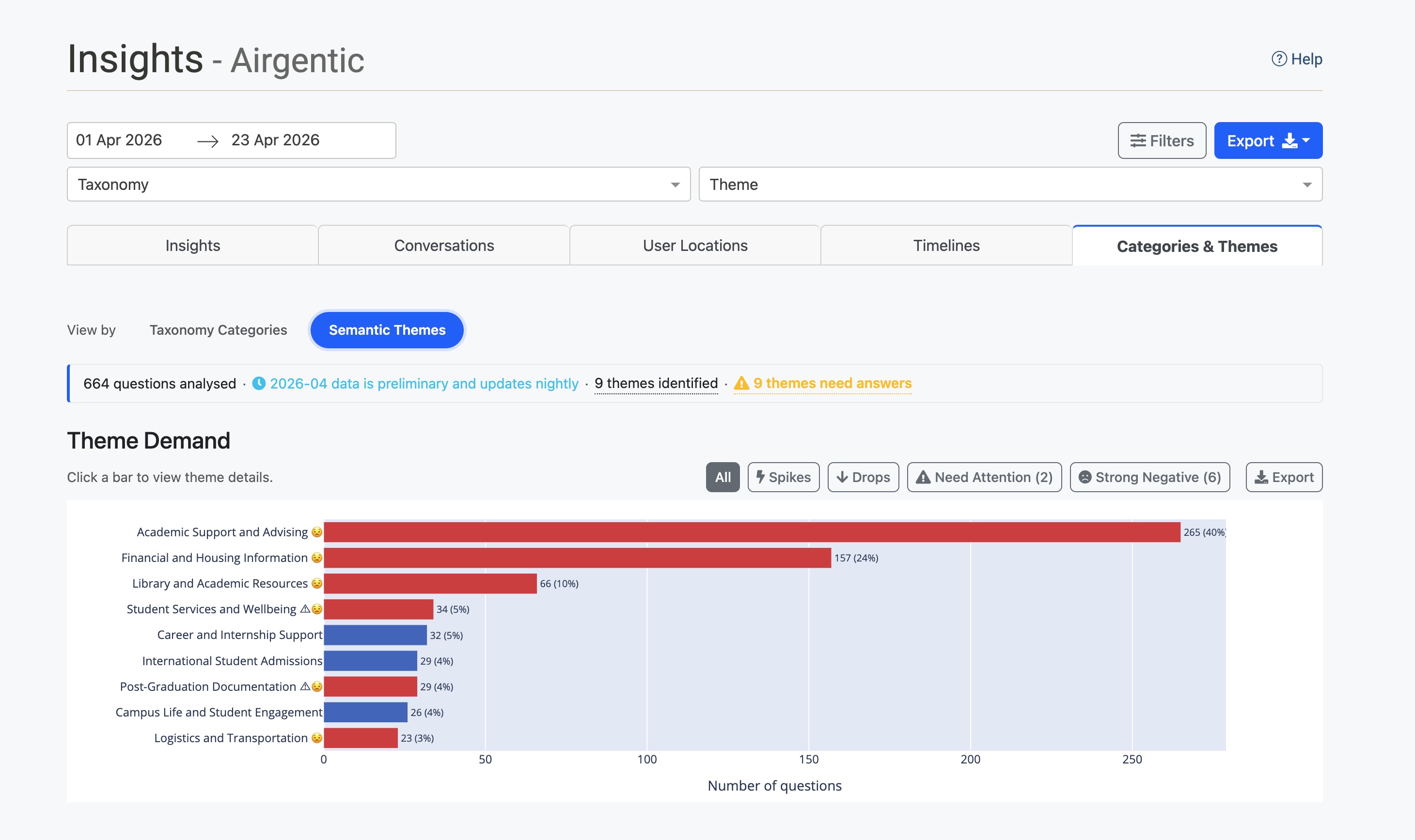
Semantic Themes
The Semantic Themes view displays automatically discovered themes:
- Theme Demand — A horizontal bar chart showing question volume per theme
- Theme Evolution — A bubble chart showing how theme volumes change across monthly periods
Each theme bar shows:
- The theme name with indicator badges
- Unique question count and percentage
- Trend indicator
Click any bar or bubble to open a drill modal showing:
- The clusters that make up this theme
- The questions within each cluster
- Confidence scores for cluster-to-theme mapping
From the modal you can:
- Click View Categories to switch to the Taxonomy Categories view, filtered to only the categories that have questions in this theme. The Theme dropdown filter at the top of the page is set automatically, and if you have multiple published taxonomies you'll see overlapping categories across each of them.
- Expand any cluster to see its questions, then click View Conversations to navigate to the Conversations tab filtered to that theme.
The Emerging Demand section highlights new topics that aren't yet mapped to established themes — potential new issues or trends worth investigating.
Drilling Through and Cross-Navigating
Throughout Categories & Themes, clicking on items lets you drill through to see the underlying conversations or pivot between views:
- Click a bar or bubble in any chart to open a detail panel
- From the detail panel you can:
- View Conversations — Jump to the Conversations tab with the relevant category, theme, or combination filter pre-applied. A banner shows what filter is active and provides a Back to Categories & Themes button.
- View Themes (from a Taxonomy Categories drill) — Switch to the Semantic Themes view filtered to only the themes that overlap with the selected category. A banner at the top of the Semantic Themes view shows the active category filter and provides a Clear button to remove it.
- View Categories (from a Semantic Themes drill) — Switch to the Taxonomy Categories view filtered to only the categories that overlap with the selected theme. A banner at the top of the Taxonomy Categories view shows the active theme filter and provides a Clear button to remove it.
- The appropriate top-of-page dropdown filters (Category or Theme) are automatically set so you can always see what you're looking at.
The cross-navigation buttons make it easy to ask follow-up questions like "which themes are driving this category?" or "which categories does this theme touch?" without leaving the page. The category/theme filter is automatically cleared when you switch views again or change taxonomy, so you never get stuck in a filtered state.
Understanding Theme Status
Themes move through a lifecycle as your service evolves:
| Status | Meaning |
|---|---|
| Active | This theme has been seen consistently and represents an established topic. |
| Emerging | This theme is new or growing — it has appeared recently or is seeing increased activity. Watch these closely. |
| Declining | This theme has seen reduced activity recently. Users may be asking about this topic less often. |
| Inactive | This theme hasn't been seen in several analysis periods and may no longer be relevant. |
The system automatically updates theme statuses based on usage trends.
How New Themes Appear
New themes can appear in two ways:
-
Seeding — When you run your first analysis, the system creates initial themes based on the clusters it discovers. These become your baseline.
-
Emergence — In subsequent runs, if a cluster is discovered that doesn't match any existing theme well, the system creates a new theme for it. These start with "Emerging" status.
Emerging themes are worth watching closely — they can indicate new issues, changing customer needs, or gaps in your content.
Nightly Updates
Categories & Themes updates automatically every night:
- Clustering runs at 03:30 UTC — grouping the current month's questions into clusters and mapping them to themes
- Classification runs at 04:00 UTC — assigning questions to your published taxonomy categories
The current month's data is marked as preliminary since new conversations are still being added. Previous months show final, stable results.
You can also trigger a manual analysis from the Topics and Themes admin screen using the +New Analysis button.
Monthly insights digest (email)
For each service, Conversational Intelligence includes an Insights Subscriptions tab where you can add one or more email addresses to receive a monthly digest summarising the most important signals from Categories & Themes — for example, themes with large answer gaps, unusual volume spikes or drops, new or lost themes, and emerging topic clusters.
- The digest covers the previous calendar month (stable, fully clustered data — not the preliminary current month).
- Delivery defaults to the 1st of the month at 09:05 Australia/Sydney (you can change the day-of-month and hour in the same tab).
- Use Preview to see an HTML sample for the last completed period without sending email; Send test email sends a one-off copy to a single address.
The email links back into Insights with the same date slice applied so you can drill into evidence. The dashboard remains the place to explore full detail; the digest highlights what changed.
Using Filters
All views in Categories & Themes respect the global filters at the top of the Insights screen:
- Date range — Focus on a specific time period (see note above about how this interacts with monthly clustering)
- Taxonomy / Category / Theme — Filter the Conversations tab to specific classifications
- Sentiment — See only positive, negative, or neutral conversations
- Geography — Filter by country, region, or city
- Channel — Filter by website or entry point
- Agent — Filter by responding agent
When you apply filters, both the Taxonomy Categories and Semantic Themes views update to reflect that filtered slice of data.
A loading indicator appears when filters are being applied to help you know when data is being refreshed.
Metrics and Indicators
Quick Stats Summary
The summary strip shows key metrics at a glance:
- Questions analysed — Total questions in the current view
- Categories/Themes identified — Number of active items
- Need attention — Items with answer rate below 85%
- Strong negative sentiment — Items with negative sentiment above 5%
Filter Buttons
Use the filter buttons to focus on specific conditions:
| Button | Shows |
|---|---|
| All | All items (default) |
| Spikes | Items with unusual increases in volume |
| Drops | Items with unusual decreases in volume |
| Need Attention | Items with low answer completeness |
| Strong Negative | Items with high negative sentiment |
Hover over any filter button to see a tooltip explaining the criteria and how many items match.
Hover Tooltips
Hover over any bar to see detailed metrics:
- Unique question count and percentage of total
- Occurrence count (if different from unique questions)
- Answer rate percentage
- Negative sentiment percentage
- Attention or sentiment warnings if applicable
Practical Applications
Identify Content Gaps
If a theme or category shows high volume but low answer completeness (visible via the ⚠ badge or Need Attention filter), you may need to add or improve content on that topic.
Track the Impact of Changes
After updating prompts, adding content, or making configuration changes, use the trend indicators and evolution charts to see whether the affected topics show improved outcomes.
Spot Emerging Issues
Watch for new "Emerging" themes that suddenly appear with high volume — these often indicate a new product issue, a marketing campaign driving questions, or a gap in your knowledge base.
Report by Business Unit
Use taxonomy categories to report on customer demand by department, product line, or any other organisational dimension. The governed structure ensures consistent categorisation over time.
Export Data
Click the Export button on any chart to download the data as CSV for further analysis or sharing with stakeholders.
Tips
- Check preliminary data — The current month is marked preliminary and will be refined as more conversations come in.
- Understand monthly boundaries — Theme clusters are generated monthly, so date range filters for themes reflect which monthly runs overlap your dates.
- Focus on high-volume items — Start with your top themes and categories by volume to understand what's driving the most questions.
- Review emerging themes — New themes may indicate genuine new topics worth investigating.
- Use multiple taxonomies — Different stakeholders may need different views of the same data (by department vs. by enquiry type, for example).
- Drill through to conversations — Click any chart element then "View Conversations" to see the actual conversations behind the numbers.
- Pivot between Taxonomy Categories and Semantic Themes — Use "View Themes" from a category drill or "View Categories" from a theme drill to instantly see how the two organising lenses overlap, without losing your context.
- Export for stakeholders — Use CSV export to share insights with colleagues who don't have admin access.
- Cross-reference with sentiment — Use the Strong Negative filter to see which themes or categories are associated with customer frustration.